All You Need to Know About Flutter Widgets
Have you ever wondered how apps are built? In Flutter, the answer lies in something magical called widgets. Let’s dive in to understand what widgets are, how they work, and why they’re so important.
What is a Widget?
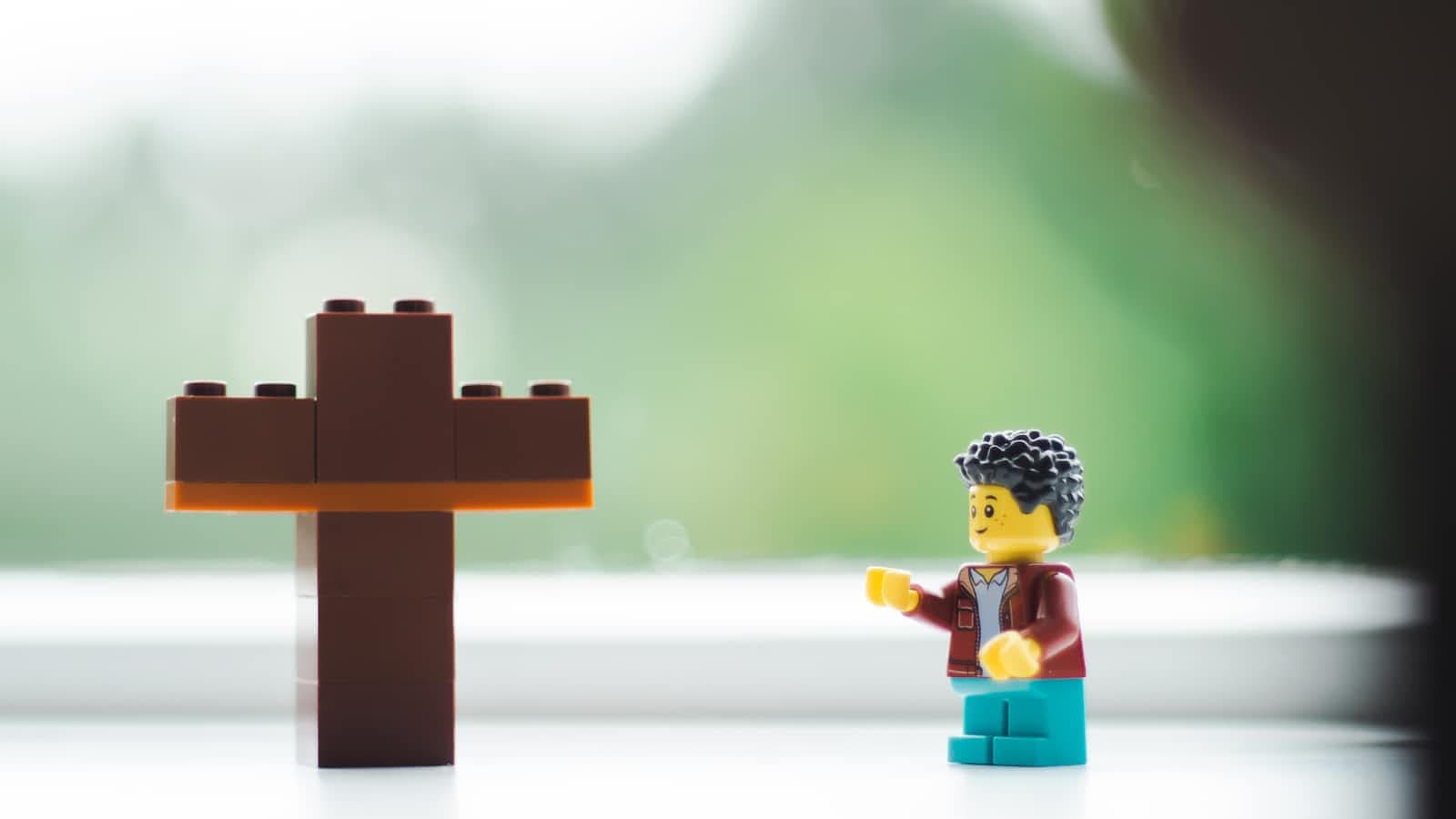
A widget is like a building block in Flutter. Imagine you’re creating a LEGO model — each piece is like a widget. Widgets are the basic units that make up your app’s user interface (UI). Everything you see on the screen in a Flutter app is a widget: buttons, text, images, and even the spaces between them.
Widgets are:
Reusable: You can use the same widget in multiple places.
Customizable: You can change how they look or behave.
Hierarchical: Widgets live inside other widgets, forming a tree-like structure.
Why Are Widgets Key to Flutter?
Flutter is all about widgets! They:
Make building UIs easy.
Let you focus on what you want rather than how to do it.
Are part of a system where everything is a widget, even things like padding and layout.
Widgets can be stateless (don’t change) or stateful (can change when you interact with them).
Starting with Core Widgets
Let’s talk about some essential widgets that you’ll use all the time in Flutter. We’ll start with the most basic ones and move to more advanced ones.
1. MaterialApp
The MaterialApp widget is like the foundation of your app. It wraps your whole app and gives it a Material Design look (Google’s design system).
void main() {
  runApp(MaterialApp(
    home: Scaffold(
      appBar: AppBar(title: Text('Hello Flutter')),
      body: Center(child: Text('Welcome to Flutter!')),
    ),
  ));
}
Why use it? It helps manage navigation (moving between screens) and themes (colors and fonts).
What if we don’t use it? Without it, your app won’t have basic features like a default design, themes, or navigation.
2. Scaffold
The Scaffold widget provides a basic structure for your app screen. It includes common UI elements like an app bar, floating action button, and a drawer.
Scaffold(
  appBar: AppBar(
    title: Text('Scaffold Example'),
  ),
  body: Center(
    child: Text('This is a Scaffold!'),
  ),
  floatingActionButton: FloatingActionButton(
    onPressed: () {},
    child: Icon(Icons.add),
  ),
);
Why use it? It saves time by giving you prebuilt components.
What if we don’t use it? You’d have to create these features manually, which can be tedious.
Now that we have the basics down, let’s look at some other widgets you’ll use frequently.
3. Container
The Container widget is like a box. You can:
Change its size.
Add color or decorations.
Use it to hold other widgets.
Container(
  width: 100,
  height: 100,
  color: Colors.blue,
  child: Center(
    child: Text(
      'Container',
      style: TextStyle(color: Colors.white),
    ),
  ),
);
The Container widget is like a box. You can:
Change its size.
Add color or decorations.
Use it to hold other widgets.
4. Center
The Center widget is used to center its child widget in the middle of the screen.
Center(
  child: Text(
    'I am centered!',
    style: TextStyle(fontSize: 20),
  ),
);
The Center widget is used to center its child widget in the middle of the screen.
5. Text
The Text widget displays text on the screen. You can customize the font, size, color, and more.
Text(
  'Hello, Flutter!',
  style: TextStyle(
    fontSize: 24,
    color: Colors.black,
    fontWeight: FontWeight.bold,
  ),
);
The Text widget displays text on the screen. You can customize the font, size, color, and more.
6. Image
The Image widget is for showing pictures. You can load images from the internet or your app’s assets.
Image.network(
  'https://flutter.dev/images/flutter-logo-sharing.png',
  width: 100,
  height: 100,
);
The Image widget is for showing pictures. You can load images from the internet, your phone, or your app’s assets.
7. Stack
The Stack widget lets you place widgets on top of each other, like layers.
Stack(
  children: [
    Container(width: 100, height: 100, color: Colors.red),
    Positioned(
      top: 20,
      left: 20,
      child: Container(width: 50, height: 50, color: Colors.blue),
    ),
  ],
);
The Stack widget lets you place widgets on top of each other, like layers.
8. Row and Column
These widgets arrange children in a horizontal (Row) or vertical (Column) direction.
Row Example:
Row(
  mainAxisAlignment: MainAxisAlignment.spaceEvenly,
  children: [
    Icon(Icons.star, size: 50, color: Colors.red),
    Icon(Icons.star, size: 50, color: Colors.green),
    Icon(Icons.star, size: 50, color: Colors.blue),
  ],
);
Column Example:
Column(
  mainAxisAlignment: MainAxisAlignment.center,
  children: [
    Text('First Item'),
    Text('Second Item'),
    Text('Third Item'),
  ],
);
These widgets arrange children in a horizontal (Row) or vertical (Column) direction.
9. ListView
Use the ListView widget to create scrollable lists of widgets.
ListView(
  children: [
    ListTile(title: Text('Item 1')),
    ListTile(title: Text('Item 2')),
    ListTile(title: Text('Item 3')),
  ],
);
Use the ListView widget to create scrollable lists of widgets.
10. Padding
The Padding widget adds space around a widget.
Padding(
  padding: EdgeInsets.all(16.0),
  child: Text('Padded Text'),
);
The Padding widget adds space around a widget.
11. ElevatedButton
This widget creates a button with some elevation, making it look raised.
ElevatedButton(
  onPressed: () {
    print('Button Pressed!');
  },
  child: Text('Click Me'),
);
This widget creates a button with some elevation, making it look raised.
12. Icon
The Icon widget displays icons, like those used for navigation or actions.
Icon(
  Icons.thumb_up,
  size: 50,
  color: Colors.blue,
);
The Icon widget displays icons, like those used for navigation or actions.
13. Card
The Card widget gives a material design card look to your content.
Card(
  child: Padding(
    padding: EdgeInsets.all(16.0),
    child: Text('This is a Card!'),
  ),
  elevation: 4,
);
The Card widget gives a material design card look to your content.
14. Expanded
The Expanded widget lets a child widget take up available space within a Row or Column.
Row(
  children: [
    Expanded(
      child: Container(color: Colors.red, height: 100),
    ),
    Expanded(
      child: Container(color: Colors.green, height: 100),
    ),
  ],
);
The Expanded widget lets a child widget take up available space within a Row or Column.
15. TextField
The TextField widget lets users input text.
TextField(
  decoration: InputDecoration(
    labelText: 'Enter your name',
    border: OutlineInputBorder(),
  ),
);
The TextField widget lets users input text.
16. AppBar
The AppBar widget provides a title bar at the top of the screen.
AppBar(
  title: Text('AppBar Example'),
  backgroundColor: Colors.blue,
);
The AppBar widget provides a title bar at the top of the screen.
17. AlertDialog
The AlertDialog widget shows a pop-up dialog box.
AlertDialog(
  title: Text('Alert'),
  content: Text('This is an alert dialog.'),
  actions: [
    TextButton(
      onPressed: () {},
      child: Text('OK'),
    ),
  ],
);
The AlertDialog widget shows a pop-up dialog box.
18. Checkbox
The Checkbox widget is for toggling options on or off.
Checkbox(
  value: true,
  onChanged: (bool? newValue) {
    print('Checkbox toggled!');
  },
);
The Checkbox widget is for toggling options on or off.
19. Slider
The Slider widget lets users select a value by sliding a thumb along a track.
20. GestureDetector
The GestureDetector widget allows you to detect gestures like taps, swipes, and pinches.
Conclusion
Widgets are the heart of Flutter. They make creating beautiful and functional apps straightforward and fun. By mastering the most commonly used widgets, you’ll be well on your way to building amazing apps. Remember, every great app starts with small blocks — just like LEGO!